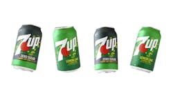
7UP debuts a refreshing new look
The first total brand design refresh since 2014 has given 7UP a new look, according to parent company Keurig Dr Pepper.
The newly designed packaging spotlights the signature elements of 7UP, including bubbles, the red dot that has been a part of the logo since the 1960s, and the red, white and green color palette. These elements represent 7UP’s crisp, clean lemon-lime taste and fun personality and provide a visual experience for the consumer across the brand’s portfolio.
“The new look is vibrant and energetic to better reflect the uplifting experience of sipping a 7UP while the fruit cues and bubbly effervescence burst off the package, introducing the familiar craving for the crisp, clean lemon-lime flavor of 7UP that consumers have loved for nearly a century,” said Allison Kapp, senior brand manager, 7UP, in a company announcement.
The 7UP Zero Sugar varieties also feature a shift, incorporating a dense color palette with hints of black that are important shopping cues for Zero Sugar category consumers.

